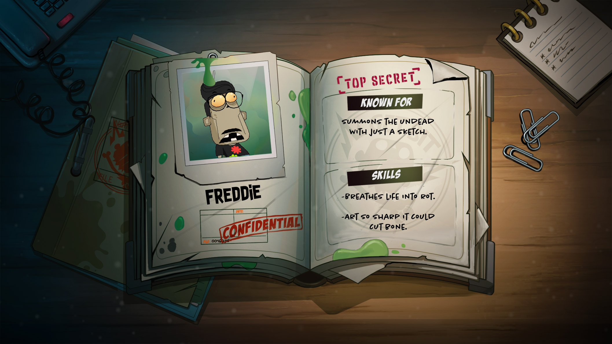
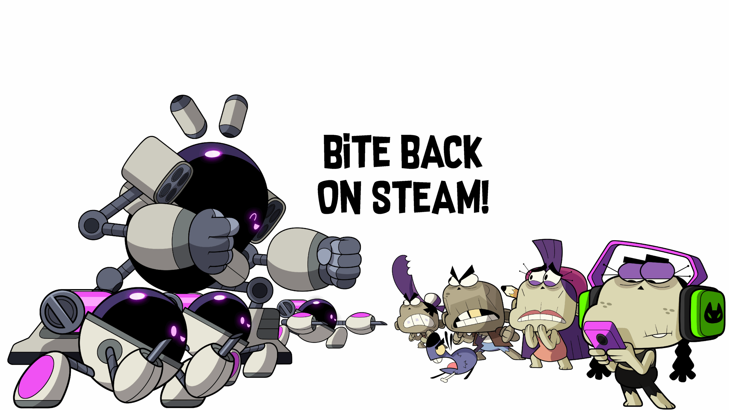
To understand how we got from “quick, functional seasonal post” to “fully illustrated undead feast dripping with personality,” we sat down with Freddie to break down the evolution, the why, the how, and everything in between.
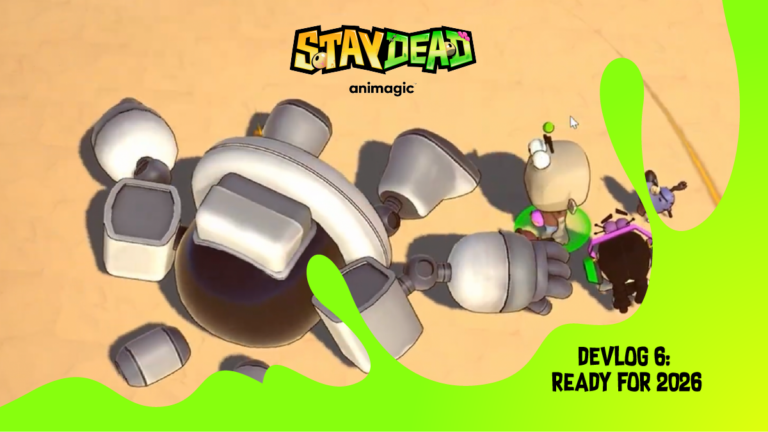
A grateful look back at how Stay Dead’s art has evolved over the last year.
Indie game development is basically one long loop of: try → tweak → redraw → panic → revise → improve → repeat.
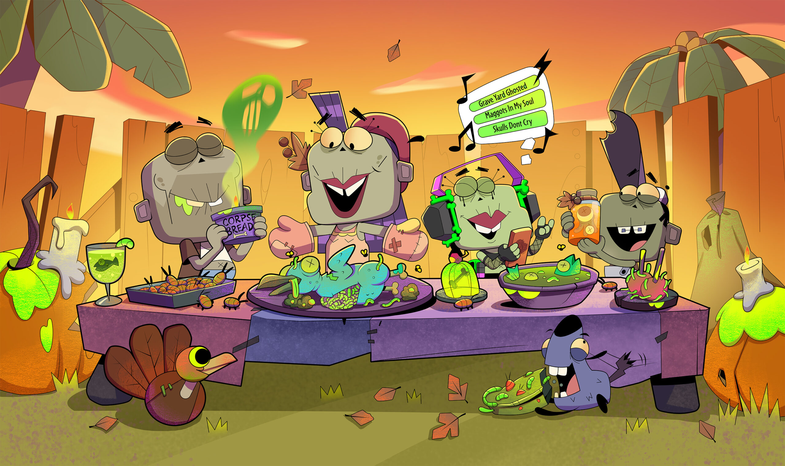
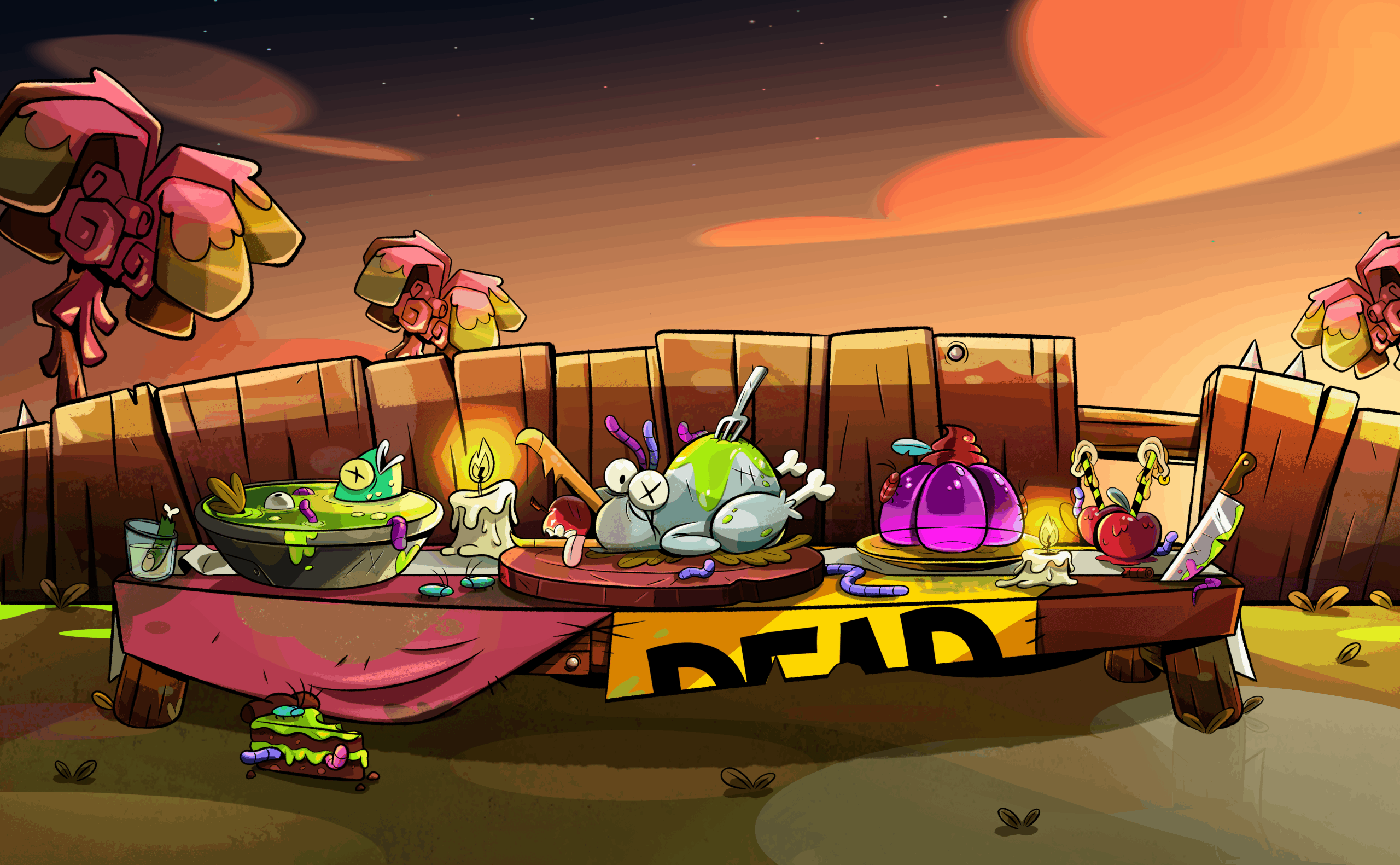
This past year, building Stay Dead has reminded us of the one universal truth of indie game development: everything is an iteration. The code, the story, the mechanics — and yes, the art. Especially the art. So this Thanksgiving, we wanted to take a moment to look back at where we started last year…and just how far our little undead universe has come.
A conversation with Freddie, Stay Dead’s Art Director
Last year’s Thanksgiving graphic (yes, the one with the big lipped cartoon smiles) came from a totally different place than this year’s. In 2024, our style wasn’t a “style” — it was a survival tactic. We were a tiny indie team building pipeline, finding our art identity, and trying to ship seasonal content without losing our minds. The art had to be fast, replicable, and something a single artist could crank out solo.
This year? Different universe. Different confidence. Different vibe.
To understand how we got from “quick, functional seasonal post” to “fully illustrated undead feast dripping with personality,” we sat down with Freddie to break down the evolution — the why, the how, and everything in between.
The 2024 Art Style Was Born Out of Necessity — Not Identity
Freddie: “In 2024, Stay Dead’s visual language wasn’t really a language yet. It was a workaround. The goal back then was simply to create a piece of content that matched the season. We were still figuring out the process, the pipeline, and even the team.”
The first Thanksgiving piece wasn’t designed to define the IP; it was designed to be produced quickly. Something one artist could replicate for marketing posts and small animations without involving multiple people. “It was all about efficiency.”
So that early art leaned on simple shapes, limited expressions, and a more mechanical, repeatable approach. Not because it was the final vision, but because it kept production moving.
“What we were doing was repeating a ‘placeholder’ artistic direction, something set up just to keep production flowing.”
At that stage, Stay Dead was pragmatic, functional… and visually restrained.
Realizing the IP Deserved More — And Growing Into It
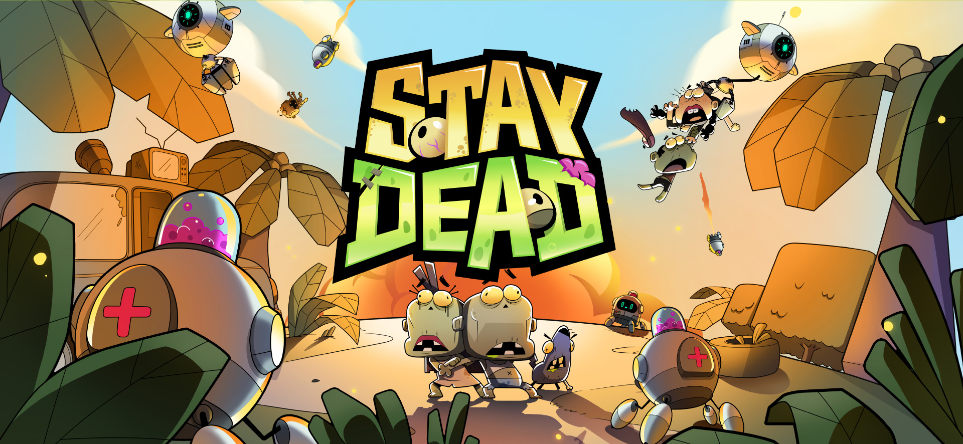
As the team kept producing content, something clicked: Stay Dead wasn’t a tiny “let’s-see-what-happens” side project anymore. It had a pulse. A personality. A world worth investing in.
Freddie: “We started seeing the potential. This wasn’t a ‘small project’ anymore. It deserved time, quality, and resources.”
That moment was the turning point. The team stopped asking: “What can we make quickly?” and started asking: “What should Stay Dead look and feel like as a full, legitimate IP?”
Freddie puts it simply: “The key has been treating it like a real IP ; with the same effort and quality we’d give any major project.”
So the team opened the door to redesigning everything with intention instead of speed: the shapes, the palettes, the posing, the personality — all of it.
Stay Dead wasn’t just being produced anymore. It was being crafted.
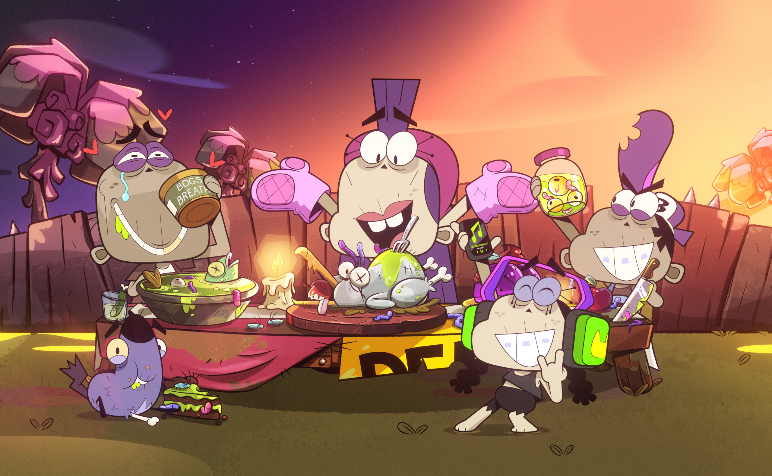
The Characters Got Their Souls Back (Literally)
One of the biggest glow-ups came from something surprisingly simple: Letting the characters actually express themselves. Early versions of the cast leaned heavily into the classic “empty-eyed zombie” trope.
Freddie: “The old characters couldn’t communicate. Their eyes looked in different directions, they felt disconnected, like they lived in their own little zombie bubble.”
The problem? If your whole shtick is emotionless undead, you can’t show humor, fear, love, annoyance, chaos, or anything that makes Stay Dead…well, Stay Dead.
To fix it, the team started with the windows to the undead soul:
“Eyes tell you everything: whether a character is thinking, sad, angry, scared, excited. Once we unlocked that, the whole world opened up.”
Now the cast is exaggerated, expressive, funny, chaotic, and charming in all the right ways. In Freddie’s words:
“Now they’re full of visual humor and that’s what Stay Dead needed.”
How Other Shows Helped Shape Our Style
When rethinking the visual direction, the team looked outward at series that balance humor, heart, exaggeration, and weirdness: the exact recipe Stay Dead thrives in.
Freddie: “Gravity Falls was huge for us, visually and narratively. It’s expressive, ironic, full of exaggerated acting. That became a major reference.”
Another big influence came from Nickelodeon:
“Wildpack. Incredibly beautiful, fun, full of life. It showed us what a strong visual identity can do for storytelling.”
These inspirations didn’t reshape Stay Dead into something derivative, they liberated it from the “flat zombie cliché.” They showed what a world can look like when every expression, pose, and gesture has intention.
“When you see our characters now, you immediately feel there’s personality behind every drawing.”
The Current Challenge: Consistency and Standardization
Once the new style existed, a fresh challenge emerged: teaching it.
Freddie: “Defining it was hard, but applying it consistently is the real challenge.”
Even when two pieces used the “same” palette, the harmony was off. Too saturated here. Too contrasty there. A little too neon elsewhere. Not the vibe.
This led the team toward its next big milestone:
“We need a production bible: something that defines line weight, brush texture, shadow rules, color hierarchy… all of it.”
The goal? 👉 Scalability. A visual identity strong enough that more artists can join the world without breaking it.
“We want to grow the team. That means solving these issues now, not later.”
Why This Evolution Matters
What began as quick, seasonal social posts has grown into a fully unified artistic language that can support:
The game
The storytelling
The characters
The brand
Future collaborators
Future animation, and beyond
Or in Freddie’s words:
“Now, when you look at a Stay Dead piece, it has an identity. It belongs to this world.”
And that’s what this year’s Thanksgiving illustration represents — not just a new piece of art, but proof of how far the IP has come.